Colour Accessibility

We aim to make Lens an accessible design system for all. To this end we work towards WCAG2.0 AA standard accessibility.

A small but vital part of these efforts are to make sure we use colour combinations that have enough contrast so that they are clear and readable.

The examples shown below that are marked as accessible are combinations that our currently used on our website. Whereas the examples marked as not accessible are not used on our website and are shown purely as an example of a bad combination.


Examples of colour contrast combinations
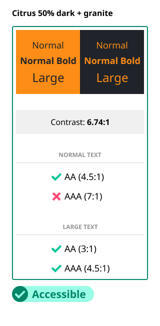
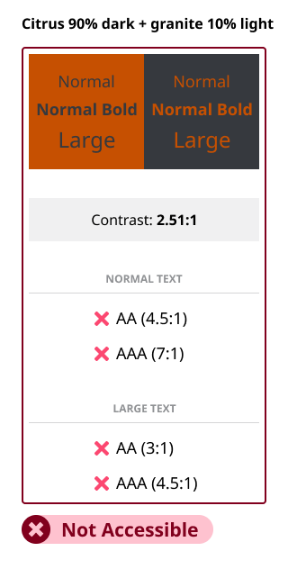

Citrus + granite

Below are some examples of accessible and inaccessible combinations of citrus and granite.
image showing the contrast ratio of our citrus + granite colours and which level of requirements they meet image showing the contrast ratio of our citrus 50% dark + granite colours and which level of requirements they meet image showing the contrast ratio of our citrus 90% dark + granite 10% light colours and which level of requirements they meet

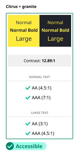
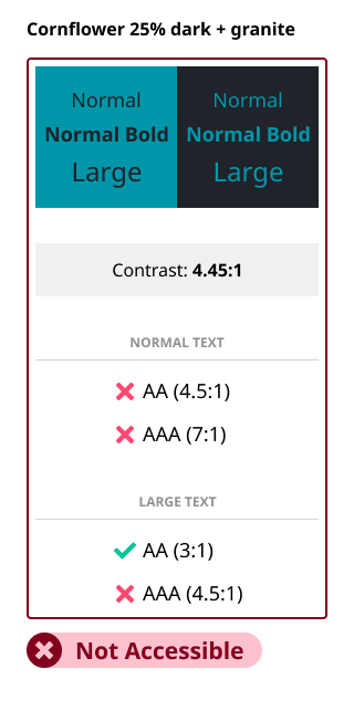
Cornflower + granite

Below are some examples of accessible and inaccessible combinations of cornflower and granite.
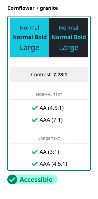
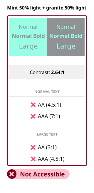
image showing the contrast ratio of our cornflower + granite colours and which level of requirements they meet image showing the contrast ratio of our cornflower 25% dark + granite colours and which level of requirements they meet

Mint + granite

Below are some examples of accessible and inaccessible combinations of mint and granite.
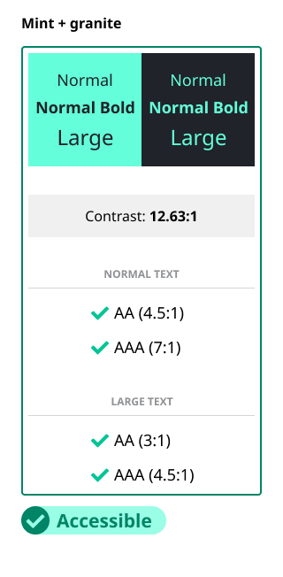
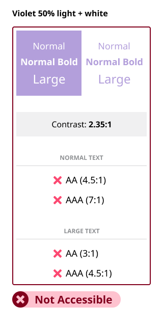
image showing the contrast ratio of our mint + granite colours and which level of requirements they meet image showing the contrast ratio of our mint 50% light + granite 50% light colours and which level of requirements they meet

Violet + white

Below are some examples of accessible and inaccessible combinations of violet and white.
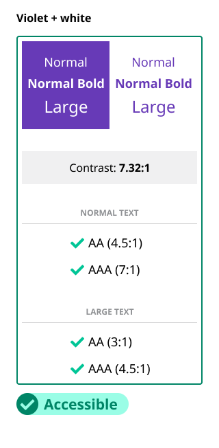
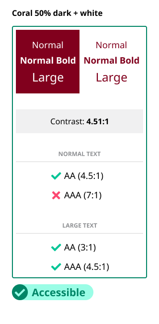
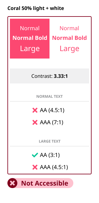
image showing the contrast ratio of our violet colour + white and which level of requirements they meet image showing the contrast ratio of our violet 50% light colour + white and which level of requirements they meet

Coral + white

Below are some examples of accessible and inaccessible combinations of coral and white.
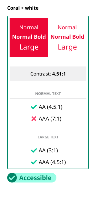
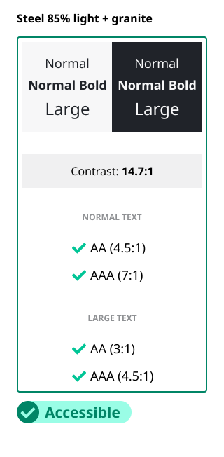
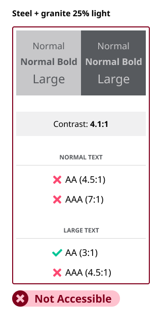
image showing the contrast ratio of our coral colour + white and which level of requirements they meet image showing the contrast ratio of our coral 50% dark colour + white and which level of requirements they meet image showing the contrast ratio of our coral 50% light colour + white and which level of requirements they meet

Steel + granite

Below are some examples of accessible and inaccessible combinations of steel and granite.
image showing the contrast ratio of our steel 50% light + granite colours and which level of requirements they meet image showing the contrast ratio of our steel 85% light + granite colours and which level of requirements they meet image showing the contrast ratio of our steel + granite 25% light colours and which level of requirements they meet