Global font size
Global font size is an important variable in how structure is defined in Lens. Lens uses a global font size of 18px. Many ingredients use the global font size to control elements of their structure. Padding, margins, and spacing between items are often derived from the global font size.
The basic grid
Lens is built on the Foundation grid.
We are currently using Foundation version 6.3.1.
Lens page layouts combine elements of the Foundation grid and our own custom flexbox-based styles.
Core breakpoints
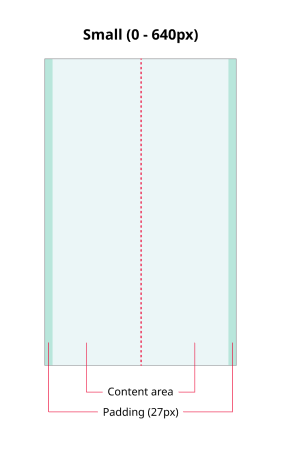
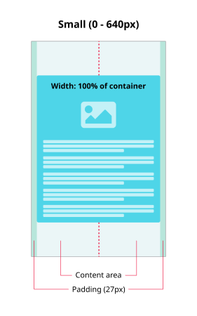
- Small (0 to 640px) — Mobile devices
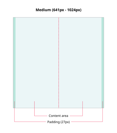
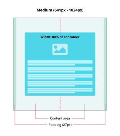
- Medium (641px to 1024px) — Tablets and larger 'mobile' devices
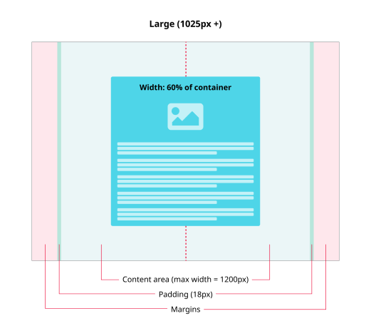
- Large (1025px and up) — Desktop/laptop computers
Grid examples
THE GRID STRUCTURE
Our default grid is based on the Foundation grid. Grids normally consist of a series of columns and gutters. However, Lens doesn’t use these elements of the grid in any meaningful way, relying instead on flexbox to organise content on page layouts. It can be more useful to think of the grid as consisting of a content area (where columns and gutters would normally be), surrounded by padding and margins.
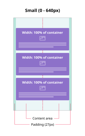
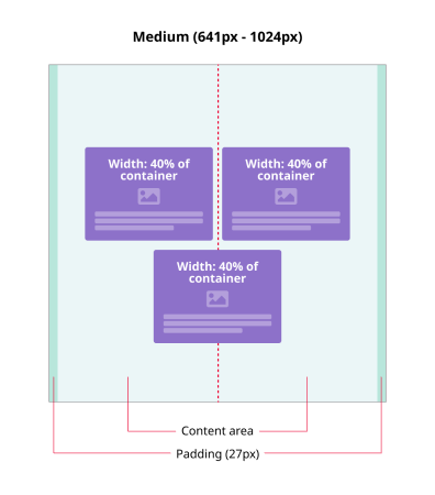
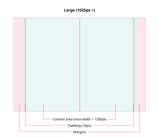
All breakpoints have a content area surrounded by padding but the small and medium breakpoints do not have margins. Here, the padding acts as a margin, providing a safe zone where no content is placed.
On the large breakpoint, margins appear once the viewport becomes wider than 1200px. No matter how wide the viewport, no content items are placed inside the margins.
CONTENT LAYOUT - SINGLE ITEM (OFF GRID)
Content is usually laid on top of the grid along a central spine and wrapped inside a flexbox. In general, content items take up a percentage of the width of their parent container (i.e. a flexbox). The actual percentage varies depending on which breakpoint is being used and how many content items are inside a container. Single items take up more of their parent container than multiple items.
CONTENT LAYOUT - THREE-UP (OFF GRID)
When a flexbox contains a row of up to three content items, they will try to arrange themselves in a single line whilst respecting their width rules. If they cannot all fit onto a single line, the last item will fall onto another line.