We aim to make Lens an accessible design system for all. To this end we work towards WCAG2.0 AA standard accessibility.
A small but vital part of these efforts are to make sure we use colour combinations that have enough contrast so they are clear.
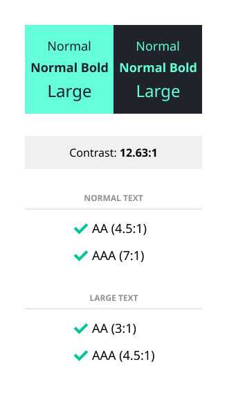
Accessible colour combinations
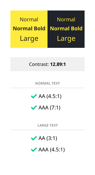
Citrus + granite
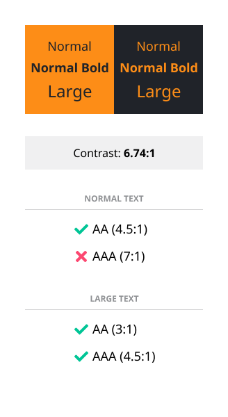
Citrus dark + granite
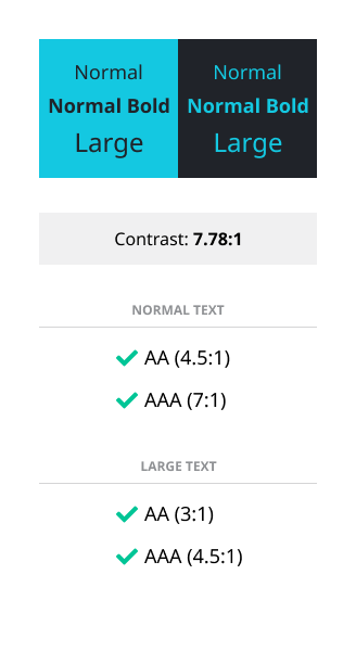
Cornflower + granite
Mint + granite
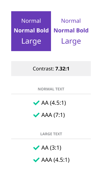
White + violet