The basic grid
Lens is built on the Foundation grid.
We are currently using Foundation version 6.3.1.
Lens page layouts combine elements of the Foundation grid and our own custom flexbox-based styles.
Core breakpoints
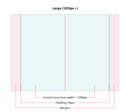
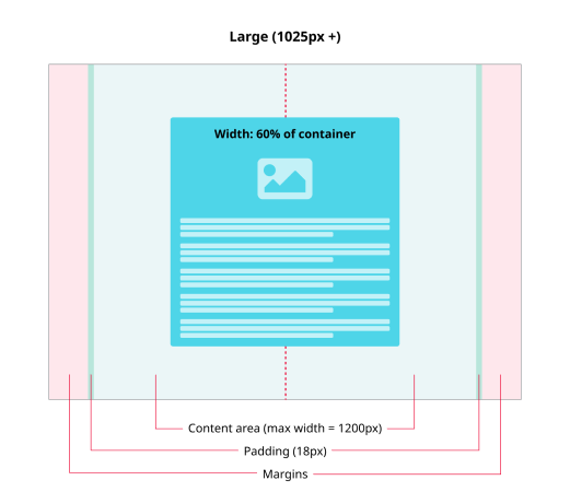
- Large (1025px and up) — Desktop/laptop computers
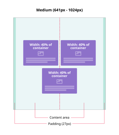
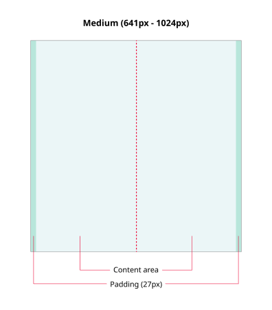
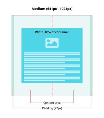
- Medium (641px to 1024px) — Tablet devices and larger 'mobile' devices
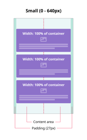
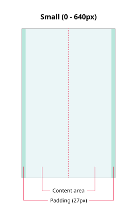
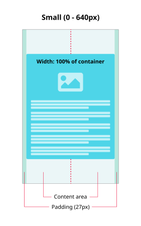
- Small (0 to 640px) — Mobile devices
Grid examples
THE GRID STRUCTURE
Our default grid consists of 24 columns separated with fixed gutters 18px wide.
SINGLE ITEM (OFF GRID)
We use the Foundation grid to scaffold the main page structure. Content items are layered on top of the grid along a central ‘spine’.
THREE-UP (OFF GRID)
A row containing either 1, 2 or 3 items in a line.