When to use images
Only use an image if it directly relates to your content and helps to communicate your message more clearly.
You can commission new images or use existing ones. Only use images which you have permission to use.
Image formats
Always try to use photographs, not illustrations. Good-quality photographs add context and dynamism to written content. For things that can't be photographed, like an unfinished building, an illustration is fine.
You can use diagrams to explain concepts visually and charts to help explain quantitative data in some circumstances.
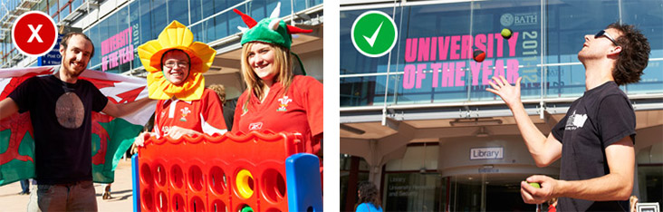
It's okay to use images with text to illustrate things on the page itself, but there must be a comprehensive text alternative in the copy of the page, as well as appropriate alt text for the image.
You should never use a diagram with text as a hero image as the text on the image would be inaccessible to people using screenreaders. Also, if the text is near the edges of the image, it won't be visible on all screen sizes.
You should never use logos to decorate a piece of content or promote an event. Instead, use an image that illustrates the topic.

Finding the right tone
The images we use say as much about us as our words do.
You should choose images that illustrate what you want to convey about different aspects of the University and reflect the diversity of our staff and students.
The image should be interesting and engaging – if you wouldn't look twice at the image, no one else will either.
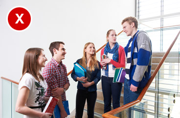
You should choose action and interaction over staged scenes.
Follow the 'rule of thirds' – images with a centrally-placed person or object do not look as good as those where the focus of the image is set to the left or right.
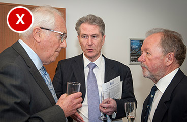
When showing social situations, avoid photographs of people who are chewing food or holding drinks.
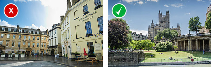
Images of Bath
Images of Bath itself should be dynamic, illustrating life in our historic city, making the viewer feel like they're already here.
Images of people
When photographing people, frame them asymmetrically. Try to create a relaxed and inclusive feel and use natural light where possible.
Staff and students come from a range of cultures and backgrounds. Make sure the people you photograph are wearing appropriate clothing and you present any images of alcohol consumption responsibly.
You should also check for unconscious bias in your choice of pictures. This may only become apparent over time. You should make sure images don't reinforce negative or stereotypical attitudes especially for ethnicity, age or gender. Studies have shown this can happen without us even being aware of it and requires positive action to avoid.
Students and staff around campus
Images should appear to be observed or captured – not posed or contrived.
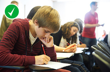
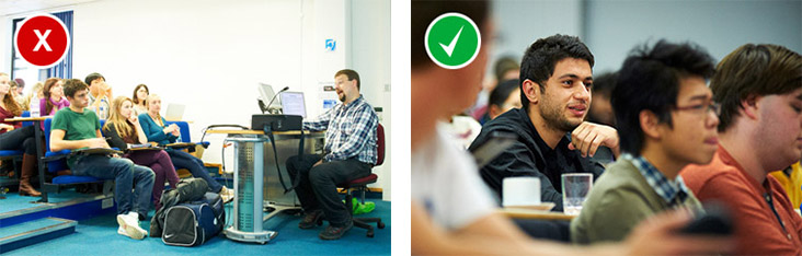
Students and staff in a learning environment
We want to promote a relaxed and collaborative feel with our photography of the learning experience. Compose photographs from a student's view to provide a sense of inclusiveness. Use natural lighting.
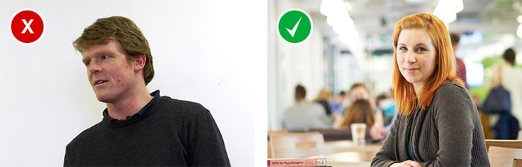
Person profile pictures
You need a portrait shot by a University photographer. This is to make sure there is consistency in the poses and backgrounds on all our Person profile pages. You can book a photographer by completing a booking request, emailing photo@bath.ac.uk or calling 01225 385478.
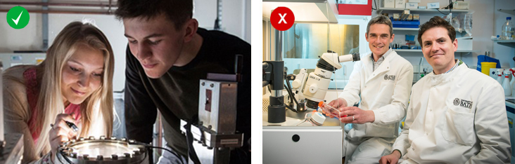
Images of research
People in white coats in a lab are not very inspiring. We should communicate the effect and impact of the research, rather than the process – this could be in a non-literal way.

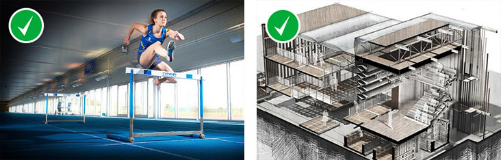
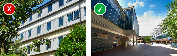
Campus architecture
Some of our architecture can be challenging to photograph, but it's important that we're able to give an impression of what our campus is like.
Images should be imaginative and taken from dynamic angles. Where possible, photographs of buildings should include people interacting within the physical environment – locating them within everyday University life.
Images used to illustrate our courses
Images used to illustrate our courses should:
- involve students interacting with each other or their course activity
- have a clear subject and backdrop with a shallow depth of field
- focus on the student, not the facilities around them
- be cropped close up
- not feature students staring directly at the camera
- not feature students with forced smiles or looking unhappy
- look as natural as possible and not staged