The University homepage is the top-level landing page for visitors to the University website. It can be published with different layouts to celebrate, publicise, or commemorate significant University or public events.
Staff and students are directed to the staff and student landing pages when accessing the University website when connected to the network. There is separate guidance for updating the staff or student landing page.
Who should update each section on the University homepage
Only members of the Communications & Engagement team and the Digital Content team can update the University homepage.
The Communications & Engagement team should only update the News and Key message sections. To update these sections, you need to edit the News partial and Key message partial.
The Digital Content team should only update the:
- Key message section
- Hero content section, media, and call to action buttons
- Split sections
- Event sections
- Multimedia embeds
- Text and image blocks
Nobody should update the:
- About this external homepage section
- Responsible Organisations and Groups section
Accessibility
You must make sure your content is accessible.
As a public sector body, we're legally required to make the content on our website as accessible as possible. The government checks our content to make sure it complies with the internationally recognised guidelines from the World Wide Web Consortium (W3C).
Find out more about accessibility or contact beta-content@bath.ac.uk if you have any questions.
Takeover layouts
In the University homepage template, you can create multiple ‘takeover’ layouts and keep them saved in draft.
The Digital Content team is responsible for creating, editing, and switching between takeover layouts.
You can switch between the layouts to edit and publish them using the dropdown menu at the top of the edit screen.
When you switch to a different layout, Typecase will automatically save the homepage. The preview page will always show the layout selected in the dropdown.
Check the layout before you publish
When you publish the University homepage, the published page will show the layout selected in the menu. Always check which layout is selected before you publish the homepage.
Visibility switches
Each component of the homepage has a visibility switch. You can toggle the visibility switch:
- off to hide the section so it’s not visible on the page
- on to make the section appear on the page
This allows you to keep sections of temporary content in draft and then add them to the homepage without having to remake them each time.
Hero section

The Hero section sits at the top of the page and can include a combination of different hero components.
Each layout has its own Hero section which you can edit without affecting the other layouts.
The Digital Content team is responsible for creating and editing Hero sections.
Hero title and summary
You can choose whether to add a title and summary to your layout. Both fields are optional, but if you don’t include a title, the summary will not appear on the page.
Hero video or image
You can add a background video or image to the Hero section. This will appear on the page behind the title and summary, if included.
To add an image, paste the static Flickr URL of the image into the Image web address field. Find out more about using images on the website.
To add a video, first you need to find the Vimeo URL of the video you want to use. Then add the following code after the long number in the Vimeo video URL:
?background=1&player_id=video&dnt=1
Your link should look like this:
https://player.vimeo.com/video/813106991?background=1&player_id=video&dnt=1
Paste the full link into the Video web address (URL) field to make it appear on the homepage.
Hero search
You can add a search component to the Hero section to help people search the website from the homepage.
To include the Hero search, tick the box next to ‘Show hero search’.
If the Hero search is hidden, the standard search bar will appear in the Global navigation instead.
Hero call to action (CTA)
You can add up to four call to action buttons that will appear in the Hero section.
Click ‘Add CTA’ to add a new CTA button, then add:
- clear and descriptive link text to the ‘Call to action button text’ field
- the destination URL to the ‘Call to action target’ field
You can remove a CTA button by clicking ‘Remove’ under the Call to action target.
Split content groups
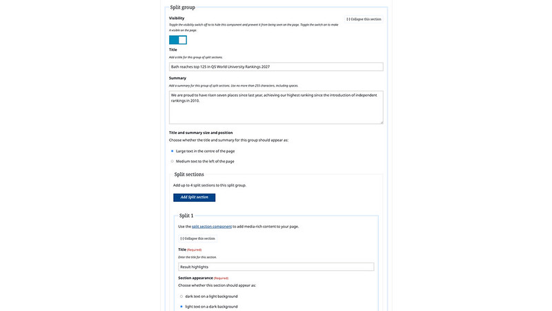
You can use the Split content group component to add text to your page opposite a:
- image
- tagline
- media embed
You can add up to four split content groups, and each group can contain up to four split sections.
For each split group, you can choose to add a title and summary. You can also choose whether the title and summary for this group should appear as:
- large text in the centre of the page
- medium text to the left of the page
Typecase creates both sizes and positions as Heading 1.
Adding content to a split content group
Click ‘Add Split section’.
Title
Use the Title field to write a heading that clearly and succinctly explains the content that follows.
Section appearance
You can choose whether the text in each split section appears dark on a light background or light on a dark background. You should only use one text-background combination in each split content group, rather than switching between light and dark.
Select one of the radio buttons next to:
- dark text on a light background
- light text on a dark background
Media size
You can choose whether to make the media in the Split section the same size as the text or wider. This might depend on the media you need to show, or how much text you need to include, but you should use the same setting throughout the page, not a combination of the two.
To choose the media size, select one of the radio buttons next to:
- media portion is the same size as the text portion
- media portion is wider than the text portion
Text block
You must add text to the Text block field in each Split section. Use Markdown if you need to format your text with subheadings, bullet points, or links.
Typecase formats the Title field for homepage Split sections as Heading 2. So, if you add a subheading to the Text block field (using Markdown), you must use Heading 3.
Associated tagline, image, or other media
You can choose whether to add an image, tagline, or other media embed to each Split section. These appear opposite the content you add in the Text block field.
Choose a side
Choose a side for your image, tagline, or other media by selecting either the 'Left' or 'Right' radio button.
You should select 'Right' for the uppermost Split section on the page, so the Text block appears on the left. This makes it easier for people to scan the page and read the information that's there.
If you use more than one Split section in a row, alternate the side the media is on to make the page look more varied and compelling.
Add a tagline
A tagline is a short sentence promoting a benefit or highlighting key information. You can choose to add a tagline to appear opposite the content in the Text block field.
To add a tagline, select the appropriate radio button under 'Choose what to add', then add your text to the 'Tagline' field.
Add an image
You can choose to add an image to appear opposite the Text block content.
Use an image that's 1920 by 1080 pixels (16:9 ratio) or larger.
Under 'Choose what to add', select 'Image', then add the:
- image web address (URL)
- alternative image text (alt text) to describe the image to people who can't see it
If your image is purely decorative, add “” to make the alt text null. Find out more about making images accessible.
Add a media embed
You can choose to add a video or audio embed to appear opposite the content in the Text block field.
You must only embed accessible video or audio content.
Select the 'Other media' radio button under 'Choose what to add', then paste the embed code of your video or audio file in the 'Embed code' field.
Make sure your iframe embed is accessible.
Find out about uploading:
Add a related content button
To direct people to content related to the split section, add:
- clear and descriptive link text to the ‘Related content button text’ field
- the destination URL to the ‘Related content button web address (URL)’ field
Multimedia embed component

Use the Multimedia embed component to add an audio recording, video, photo gallery, or map.
You can add up to three Multimedia components to the homepage.
Make sure you add captions to videos and provide transcripts of audio filesso that everyone has access to the same content.
Paste the embed code into the 'Embed code' field and write a summary to let users know what it is or who it features.
Text and image block component

You can add up to six text and image blocks to the University homepage.
You must add a title, summary, and text to the component. You can also add an image, tagline, and related content button.
Events section

You can add an Events section to show important upcoming events.
You can add a different Events section to each homepage layout to show relevant events during homepage takeovers.
You must add a title to the section and can choose to add a summary as well. You can also choose whether these should appear as large text in the centre of the page, or medium text to the left of the page.
Adding Event items
Events added to the homepage should be high-profile University events only.
You must add at least one Event item to make the Events section appear on the homepage.
Event items must be published using the Event content type in Typecase before you can add them to the homepage Events section.
You can show up to six events at the same time on each homepage layout.
To add an Event item, start typing the event name in the search field, then select it from the list.
The new Event will appear at the bottom of the list. You can reorder the Event items by dragging and dropping.